OCD is not about needing everything neat and in its place.
It’s important to remember that there is a D in OCD, which stands for DISORDER.
In 2016 we introduced a new logo...
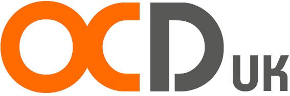
This is our logo, and let us explain the reasoning behind this design.
In recent years we have seen the OCD acronym and ‘meaning’ hijacked to suggest a person who is pernickety and fussy. So in 2016 we decided to update our logo to help change the perception that everyone is a ‘little OCD’ and highlight the ‘D’ in OCD, to ensure the general public understand that it stands for Disorder.
We highlighted the ‘D’ in a darker colour to show the dark places OCD takes us sometimes and the gloomy mood it can leave us feeling. We left the ‘D’ slightly broken to show people with OCD that no matter how dark OCD gets, we can break the cycle and break free from the disorder.
The ‘O’ and ‘C’ are entwined to illustrate how obsessions and compulsions cross over and are linked together. The ‘C’ is left slightly narrower than the ‘O’ to demonstrate that the obsessions are the driving force of OCD.
We want our logo to be a practical tool to help illustrate the severity of OCD and help us all raise awareness of Obsessive-Compulsive Disorder.
Logo Feedback (via Facebook)
“I think this is fantastic and will hopefully quell the rash and hurtful comments that people make all too often without thinking about the effect their words will have.” - Richard
“Really great logo - a lot of thought (no pun intended!) has gone into it. Well done!” - Tim
“Excellent, really good work, and wonderfully meaningful.” - Sarah
“I love the thinking behind your new logo, thank you for everything you do on behalf of people who really suffer this hell on earth disorder.” - Clare